 Occasionally, I'm asked by colleagues or clients to send samples of "great slides" or "good PowerPoint." I usually hesitate to send examples of slides since my answer to the question, "what does a great PowerPoint slide look like?" is "...it depends." In a world which often thinks in terms of absolutes ― "this is good, that is bad" ― "it depends" is not the most popular answer.
Context matters
However, as far as design is concerned, it is useful not to think (judge) in terms of "right or wrong," but rather in terms of what is "appropriate or inappropriate." That is, is it appropriate or inappropriate for a particular context? "Good" and "bad" are indeed terms we use when talking about design ― including PowerPoint slides ― but I'm personally cautious of this dualistic thinking, especially when judging a design without its full context available. So much depends on how the visual is placed within the context of the presentation, and the content and objectives of that particular presentation are of paramount concern. Without a good knowledge of the place and circumstance, and the content and context of a presentation, it is impossible to say this is "appropriate" and that is "inappropriate."
Simple but not simplistic
If there is one important precept worth following, it is the idea of simplicity. The best visuals are often ones designed with an eye toward simplicity. Yet, this says nothing about the specifics of a visual presentation. That will depend on the content and context. For example, even the best visuals used in support of a presentation for one audience on, say, quantum mechanics, may appear complicated and confusing to a different audience.
Simplicity is often used as a means to greater clarity. However, simplicity can also be viewed as a consequence. A consequence, that is, of our careful efforts to craft a story and create supporting visuals that focus on our audience's needs in a clear and meaningful way. Ok, simplicity is great you say, but how simple? What is the formula for simplicity? If you can't give me concrete examples, you might say, at least give me a formula for making powerful, simple visuals. But do static formulas for achieving simplicity exist?
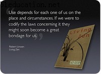
In Living Zen, author Robert Linsen (in speaking on the simplification of needs in everyday life) says that a "simplification of existence" is a consequence of an "effective experience of Zen." In other words, as one discovers their true nature, "needs" such as possessions or status are reduced or seen for what they are: superfluous. This begs the question then: "What are the minimum or maximum needs for an individual?" To this the author responds
"No one can define them or draw up a system around them. That is where we should exercise our judgment....Use depends for each one of us on the place and circumstances. If we were to codify the laws concerning it they might soon become a great bondage for us."
Here the author is not necessarily speaking of design and presentation visuals, of course, but we can see how we can apply Zen principles to everyday life including design, even the design of slides and other visuals. Simplicity is an important design principle. But simplicity in design is as much art (small "a") as science. It is, therefore, quite difficult to offer up prescriptions or "rules" for appropriate design. Without full knowledge of the context and circumstances, such rules could become "a great bondage," so to speak, leading to inappropriate design choices or recommendations.
Visual makeover
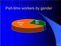
Having said all of that, below are a few slides demonstrating different visual treatments in support of a single message. The context is a presentation on gender and labor issues in Japan. The purpose of the slide is to visually support the claim that "72% of the part-time workers in Japan are women." This statistic is from the Japanese Ministry of Labor. The figure "72%" is something the presenter said she wanted the audience to remember as it is discussed again as the presentation progresses. So how to design a slide that is subtle, simple, memorable, and fits into a theme that is appealing and attractive?
BEFORE. Above (left) is the original slide. The problem with the slide on the left is that the clip-art used does not reinforce the statistic, nor does it even fit the theme of women in the Japanese labor market. The background is a tired, overused PowerPoint template. The text is difficult to read. And as one trainee commented: "it's ugly."
The slide on the right (above) was an effort to display the same information in a pie chart. Besides using an overused template, the visual displays the pie chart in a distorted and inelegant fashion. For the sake of clarity, it is usually best to avoid 3-D effects. Also, rather than giving the slide a title, a declarative sentence that states the point directly may be more appropriate.
AFTER: All the slides were redesigned to match the theme above. The slide on the left was the one used for the presentations. But the one on the right could also be used effectively. Notice that either slide (especially the slide without any text) would be virtually meaningless without the presenter's narration. The handout that followed the presentation expanded on the relevance of the statistic and gave it context. The five-page handout proved to be a good reference for those who attended the presentation and for those who did not.
Using a pie chart is also a good way to represent this simple statistic. Here (left) the large text at the top can be easily seen. The text reads more like a headline ― a declarative sentence ― rather than just a title or category. The slide on the right is another possible way to support the message. In this case a completely different template was used.
Should you design your slides to look like this?
The design choices are many. The examples above are just a few attempts at improving the look & feel, impact, and effectiveness of the original slides. Should you design your slides to look like this? That's your call and depends on your specific circumstance. Also, this particular example does not deal with a technical presentation. If your presentation is on a less technical topic such as leadership, HRM, marketing, etc. then simple slides like these may be very effective. If you are giving a very technical presentation to a technical audience hungry for data, then your slides may look quite different. But even for a very technical presentation, embracing simplicity of design and striving for the greatest clarity possible should still be the objective. How you do that will depend on a great many things.
In future I will show a design makeover featuring more technical content. In the meantime, if you have good examples of visual support for very technical presentation content, please feel free to share it with me. I'd love to see your examples.


